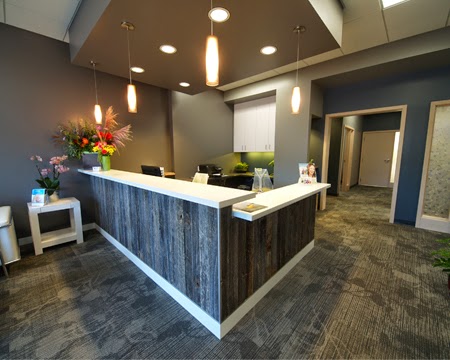
LEED-certified The Foundation Architects worked with the owner of Mount Royal Dental in Duluth to design an office that is environmentally friendly. The result? A beautiful clinic that boasts smart materials and systems. The project pays attention to the environment in other ways, too. The clinic’s design has a vernacular port feel with a modern aesthetic.
Fluorescent lamps, low VOC paint and recyclable carpet, tiles and flooring—including reclaimed barn wood—are just some of the green materials used in the design. The space includes a floor plan that flows naturally for patients and staff. Take a look:
The mixture of reclaimed barn siding and other simple, clean materials is inviting—and good for the environment.
Patients and staff appreciate the easy-to-understand floor plan.
The treatment rooms are separated acoustically but share light by using resin panels with actual leaves embedded in the design.
See more photos of this project—and tell us what you think! We'd love to hear from you.
Showing posts with label The Lead. Show all posts
Tuesday, April 8, 2014
Thursday, March 13, 2014
Excellence Delivered
Amma Parenting Center in Edina is a one-stop shop that offers classes, support groups and baby products for new and expectant parents. However, in its previous life, the space housed an insurance company. Thanks to The Foundation Architects, this former office space is now a space for engagement and education.
To better utilize the space, The Foundation Architects added another classroom to turn it into a three-classroom center, decreased office space in order to expand the retail area, and incorporated Amma’s brand into the architecture by making a customized desk in the reception/cashier area with the company’s logo. The center exudes a friendly, calm and cheerful vibe—exactly what the doctor ordered.
The design incorporates Amma's logo and brand.

Amma Parenting Center provides a colorful and fun retail experience.
Finish and color selections enhance the friendly feel of the space.
View more spaces designed by The Foundation.
To better utilize the space, The Foundation Architects added another classroom to turn it into a three-classroom center, decreased office space in order to expand the retail area, and incorporated Amma’s brand into the architecture by making a customized desk in the reception/cashier area with the company’s logo. The center exudes a friendly, calm and cheerful vibe—exactly what the doctor ordered.
The design incorporates Amma's logo and brand.

Amma Parenting Center provides a colorful and fun retail experience.
Finish and color selections enhance the friendly feel of the space.
View more spaces designed by The Foundation.
Labels:
Commercial,
The Lead
Tuesday, February 11, 2014
A Deck to Infinity
The addition of a high-design deck can greatly improve the aesthetics of the house—especially in the back where many homes lack architectural interest. It also extends a family’s livable space, which makes it great for entertaining and taking advantage of fine weather.
The side railings are made from the decking boards, and the end railing is Cable Rail with stainless steel supports. The deck in this project was conceptually designed to be a deck to infinity; the lines leading toward the far end of the deck act to exaggerate the perspective and make it appear longer.
The structure was designed to take up minimal vertical space to allow for more light under the deck and more headroom.
View more spaces designed by The Foundation.
This deck is constructed from Red Cumaru—a sustainable tropical hardwood
with great durability and weathering properties.
The structure is a mixture of Parallam® beams—a proprietary product made
from strands of wood from farmed trees glued together with a resin to
render it structurally stronger than standard lumber—and galvanized
steel columns and supports, as well as standard treated lumber.
The side railings are made from the decking boards, and the end railing is Cable Rail with stainless steel supports. The deck in this project was conceptually designed to be a deck to infinity; the lines leading toward the far end of the deck act to exaggerate the perspective and make it appear longer.
The structure was designed to take up minimal vertical space to allow for more light under the deck and more headroom.
View more spaces designed by The Foundation.
Labels:
Quick Take,
Residential,
The Detail,
The Form,
The Hot List,
The Lead
Thursday, January 2, 2014
Creating Connections at Lakeland Family Dental
Lakeland Family Dental was renovated with a new entrance, signage and clean, modern concrete details that add scale and personality.
A simple, modern reception area is business efficient, yet the warm materials and finishes are inviting to patients.
The open entryway guides patients in and out of the clinic while connecting the exterior and the interior with a defining concrete wall and signage.
State-of-the-art dental equipment is a necessity for progressive clinics like Lakeland Family Dental.
Smart additions like the pictured alcove and details like color and texture help integrate the technology and keep the equipment from looking or feeling too imposing.
Details like the board-formed concrete and the glass inset in the doors add personality and enhance the clinic environment. Unique details like this have a calming effect. Learn more about incorporating design that makes commercial spaces feel more inviting.
A unique challenge with this project was that the parking lot was oriented in a strange position to the building. Read about our unique solution that helps visitors connect to the entryway and feel welcome at Lakeland Family Dental.
Architects: The Foundation Architects
Interior Design: Bob Shaffer
General Contractor: Heritage Construction Companies LLC
Dental Equipment: Henry Schein Dental
A simple, modern reception area is business efficient, yet the warm materials and finishes are inviting to patients.
The open entryway guides patients in and out of the clinic while connecting the exterior and the interior with a defining concrete wall and signage.
State-of-the-art dental equipment is a necessity for progressive clinics like Lakeland Family Dental.Smart additions like the pictured alcove and details like color and texture help integrate the technology and keep the equipment from looking or feeling too imposing.
Details like the board-formed concrete and the glass inset in the doors add personality and enhance the clinic environment. Unique details like this have a calming effect. Learn more about incorporating design that makes commercial spaces feel more inviting.
A unique challenge with this project was that the parking lot was oriented in a strange position to the building. Read about our unique solution that helps visitors connect to the entryway and feel welcome at Lakeland Family Dental.
Architects: The Foundation Architects
Interior Design: Bob Shaffer
General Contractor: Heritage Construction Companies LLC
Dental Equipment: Henry Schein Dental
Labels:
Commercial,
Dental,
Quick Take,
Residential,
The Detail,
The Form,
The Hot List,
The Lead
Tuesday, November 26, 2013
Inspiring Interaction with Design
The building that now serves as the space for digital marketing agency IdeaPark is in a large colonial warehouse built in 1890. The space had been used by an insurance company and other retail. It was a great space, but it wasn’t being utilized to its full capacity.
The Foundation Architects approached the remodel based on the flow of ideas, which is nonlinear. The building was gutted; walls were removed. The space was reconfigured with the introduction of curved walls and other on-brand shapes that mimicked nature—like smooth, flowing hills and clouds.
Every detail reinforces the IdeaPark brand. Most office areas have natural light and feature a view of the outdoors. Smart planning created more retail space, which increases the business’s profit potential.
The space was redesigned for its current culture and function. The result is lively, fun atmosphere where creativity flows freely—a space branded for what they do—who they are.
Architects: The Foundation Architects
Interior Design: Bob Shaffer
![]() |
| Light boxes and dark finishes juxtaposed to create a welcoming entry. |
The Foundation Architects approached the remodel based on the flow of ideas, which is nonlinear. The building was gutted; walls were removed. The space was reconfigured with the introduction of curved walls and other on-brand shapes that mimicked nature—like smooth, flowing hills and clouds.
Every detail reinforces the IdeaPark brand. Most office areas have natural light and feature a view of the outdoors. Smart planning created more retail space, which increases the business’s profit potential.
![]() |
| Brainstorming with efficiency. |
![]() |
| Break rooms also can be additional collaboration areas when designed creatively. |
![]() |
| Even the corridors are fun in this space. |
The space was redesigned for its current culture and function. The result is lively, fun atmosphere where creativity flows freely—a space branded for what they do—who they are.
Architects: The Foundation Architects
Interior Design: Bob Shaffer
Labels:
Commercial,
Quick Take,
Residential,
The Detail,
The Form,
The Hot List,
The Lead
Wednesday, September 18, 2013
Welcoming Design at Siverson Dental Care
Siverson Dental Care was remodeled to create a warm firm impression that makes guests feel calm and welcome immediately upon entering the clinic.
Curved walls soothe patients and offer cues that lead them to the
seating area.
Additional design elements were incorporated to help patients feel connected to and comfortable in this dental environment.
The convenience center was designed to allow patients entering the treatment area to pick up a brochure on a procedure.
Also, upon leaving, the patient has an opportunity to check their appearance, and children can pick out their sticker or toy.
The sterilization area is clean, modern and simple—reinforcing the functional purpose of the space.
The modern appearance of the treatment area is warmed by earth tones and textures. Tones and textures that mimic those in nature are calming.

Each treatment area is a modern, warm environment designed to encourage patient relaxation.
The treatment areas feel connected to the clinic as a whole, so patients don’t feel isolated. Windows are a great way to accomplish this. Even when patients are not directly looking through a window to the outdoors, they have a sense of their environment and its connection to where they are. An unfamiliar setting becomes more familiar and comfortable.
Patients leaving the clinic get a great last impression and a warm farewell from reception.
Contractor: Karkela Construction, Inc.
Dental Equipment: Patterson Dental
Architects: The Foundation Architects
Interior Design: Bob Shaffer
Curved walls soothe patients and offer cues that lead them to the
seating area.
Additional design elements were incorporated to help patients feel connected to and comfortable in this dental environment.
The convenience center was designed to allow patients entering the treatment area to pick up a brochure on a procedure.
Also, upon leaving, the patient has an opportunity to check their appearance, and children can pick out their sticker or toy.
The sterilization area is clean, modern and simple—reinforcing the functional purpose of the space.
The modern appearance of the treatment area is warmed by earth tones and textures. Tones and textures that mimic those in nature are calming.

Each treatment area is a modern, warm environment designed to encourage patient relaxation.
The treatment areas feel connected to the clinic as a whole, so patients don’t feel isolated. Windows are a great way to accomplish this. Even when patients are not directly looking through a window to the outdoors, they have a sense of their environment and its connection to where they are. An unfamiliar setting becomes more familiar and comfortable.
Patients leaving the clinic get a great last impression and a warm farewell from reception.
Contractor: Karkela Construction, Inc.
Dental Equipment: Patterson Dental
Architects: The Foundation Architects
Interior Design: Bob Shaffer
Labels:
Dental,
Quick Take,
Residential,
The Detail,
The Form,
The Hot List,
The Lead
Subscribe to:
Posts (Atom)